All buttered up.
Illustration is always fun to do, especially when its for packaging.
So when we were asked to update the branding and packaging for Kaptein’s Echte Boter we readily obliged.
Problem(s):
-Illustrations felt outdated
-Color blue felt too cheap
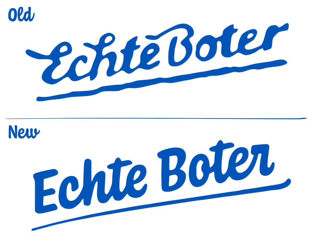
-Wordlogo felt outdated
-Too many elements, bring more ‘air’
Additional needs:
-After approval, take design and apply to new products
Where to begin.
We started with the identity and took a look at the logo. It needed a more dynamic and organic flow to accompany the values and future ventures without losing too much of its identity so we maintained the skewed angle and underlining.
We changed to blue to a more deep, royal blue to give it more depth.
Of course, this was a process but the comparison speaks for itself.
Drawing a line.
The next step were the illustrations. We decided to give the farm a more prominent place but to skip the red on the roof. This would give each part of the illustration more of its own placement on the pack.
The flag would be the only part of the packaging containing red and therefore it would not fight for attention with the other elements.
We swapped the typical Dutch mills for the more often seen windmills so it would feel more of this day and age. The linework has the same flow as the wordlogo and eventually we could not pass up some birds in the sky to make it feel more like you were actually looking at an acre.
Done?
Not quite, because they had a surprise remember?
They wanted a range of new products to be developed in the same style as the updated Echte Boter: Echte Smeerkaas and Echte Kaas.
Echte Smeerkaas was pretty much a color exploration for a range of flavors whilst using the existing design from Echte Boter. For Echte Kaas we delivered the concept design but eventually were not responsible for the final design since there was almost a 4 year span between the two.


